I’ve written about inflation several times previously (here, here, here, and here), but it’s a topic I keep returning to because I feel like it’s a concept that many people still don’t really understand. And, unfortunately, that often means they reach invalid conclusions, which can lead to poor financial decisions and/or lead people to just feel really bad about life when – at least in the context of inflation – they shouldn’t. And even when presented with the data, people will often respond with some variation of, “I don’t believe it!”. Here are some recent items I shared on social media and I thought it might be helpful to discuss them to help folks better understand the concepts involved.
Note: At times I have been accused of sharing these for political reasons. That is not the case. I’m sharing the data in order to provide context for folks and to try to educate them so that they have a better understanding of what’s really going on, as opposed to their intuitive opinions which are sometimes incorrect. The better we understand these concepts, the better decisions we can make (and, as I said above, we perhaps will feel happier).
Now, to be clear, I do have strong political opinions (which I often share on social media), and I’m happy to discuss which policies I think are the best policies to address many issues, including inflation. But when I was sharing these particular items, I was simply sharing the data. In order to be political, one would need to attribute causes for these results and/or suggest policy solutions going forward. I did not do that. The data doesn’t care about our personal political beliefs. (And, again, I’m happy to have discussions where I do attribute causes or propose solutions, in line with my values, but that is not the intent of this post. It’s simply to educate.)
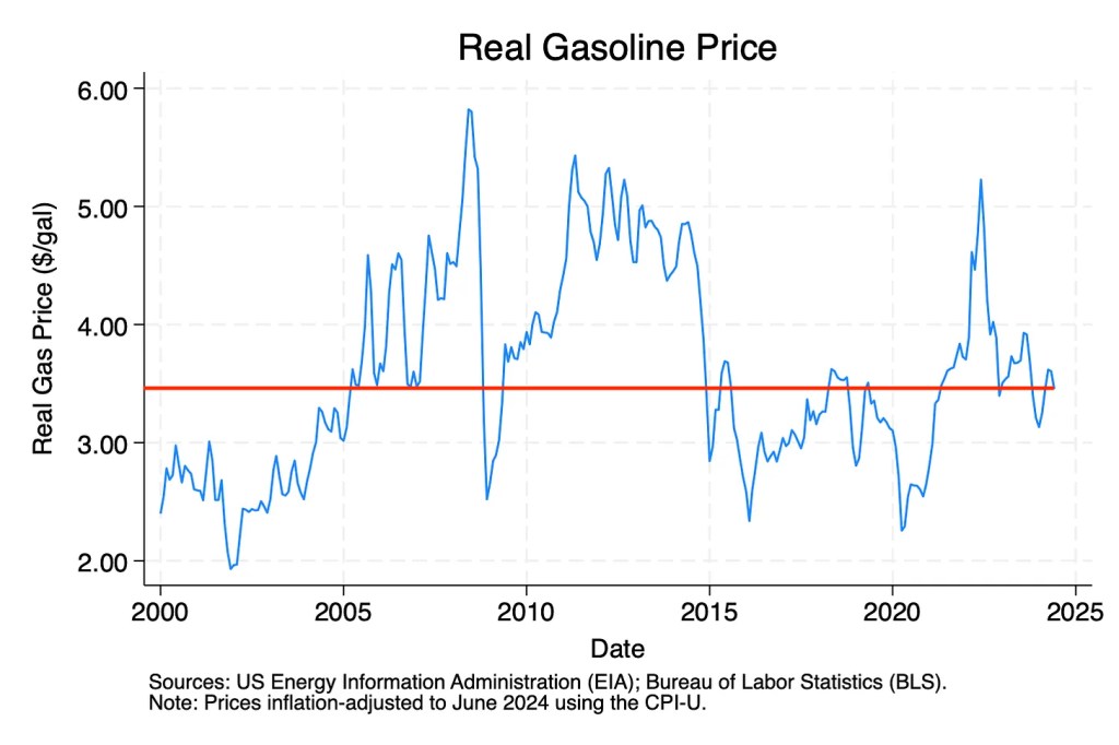
The first item I shared that some people didn’t believe was about gas prices, specifically this chart (I added the red line).
Here was a typical response.
While it’s certainly possible that they paid $1.60/gallon for gas during the pandemic (average prices dropped almost to $2.00, so it’s possible that local prices at one point were $1.60), they are ignoring supply and demand factors as well as inflation. Oil is a global market, and the price of gas is largely determined by supply (production) and demand (usage). During the pandemic, demand dropped drastically, so prices did as well. And, as the graph shows, current real (inflation adjusted) gas prices are about the same as they were in 2019, 2016, late 2009, 2007, and as early as late 2005. In between they rose and fell, largely due to supply and demand.
Note: Presidents get way too much blame (and credit) for gas prices. Presidents have very little impact on gas prices during their term, as the price is set by the global market. On a short-term basis, they can perhaps affect prices on the margin by releases from the national oil reserves during a time of high demand. But that’s a small – and temporary – impact. And, of course, when those reserves have to be replenished, it has the opposite effect.
More recently I posted about gas prices again, but with a longer time frame and a slightly different reference point (not inflation per se, but related to average wage).
This extends the time frame all the way back to 1974. It demonstrates that gas prices are essentially the same as then (when adjusted for wages, which is arguably even a better comparison than inflation). (And with 2024 wages and prices, it’s back to 7.2 minutes.)
I then tried to provide further context, because this is actually underselling the point. Because in 1974 the average miles per gallon for cars in the U.S. was 13.6 mpg, while today it is almost 26 mpg. Which means (for the average vehicle, and of course there are many vehicles today that get much more than the average, which was not the case in 1974) you can travel approximately 48% further on each gallon of gasoline. So, in reality, the practical cost of gasoline is approximately 48% less than in 1974.
While I’m sure there are multiple reasons why people “don’t believe it,” a primary reason is anchoring. We tend to anchor on prices, but not on income. So, for example, we’ll recall that “gas cost so and so in 19xx and it costs so much more today”, but we don’t do the equivalent “but in 19xx I was making this much and now I’m making so much more.”
This time the response was even stronger, suggesting the data was manufactured and/or inaccurate, and that I was posting it because it is “election season.” Again, the data is the data, and is independent of our political beliefs. If I had included a causal reason for this, then it could perhaps be political. For example, if I had said, “Due to the effects of the 2017 Tax Cut and Jobs Act, wages have exceeded inflation from 2019 through 2024,” that could be construed as political. Although I would argue that even that doesn’t have to be political, if you can demonstrate the causal mechanism without assigning your values to it. But the reality is that almost always we are including our values when we make that type of statement.
Note: To be fair, when I posted the link and the chart I didn’t provide the context for why I was posting it. I had run across something interesting and, in my head, it related to other things I had been posting about, so I quickly shared it and moved on. I should’ve provided the context and the reason I was posting it – basically the ideas in this blog post – but I didn’t. I will try to learn from that and do better in the future.
So, to be clear, the reason for sharing this information was/is because many people’s intuitive thoughts about this issue are incorrect (hence, the “I don’t believe it” type comments). Yet the evidence shows differently, and I think it’s really important that we think about and make decisions based on the actual data, not our (sometimes) faulty intuition.
Note: As always, individual circumstances vary. This particular data is looking at the median wage, and obviously some individual’s wages as compared to inflation may not look so great. But, in aggregate, this is the data, and it’s important when making decisions (and, yes, when talking politics) to rely as much as possible on data, not anecdote.
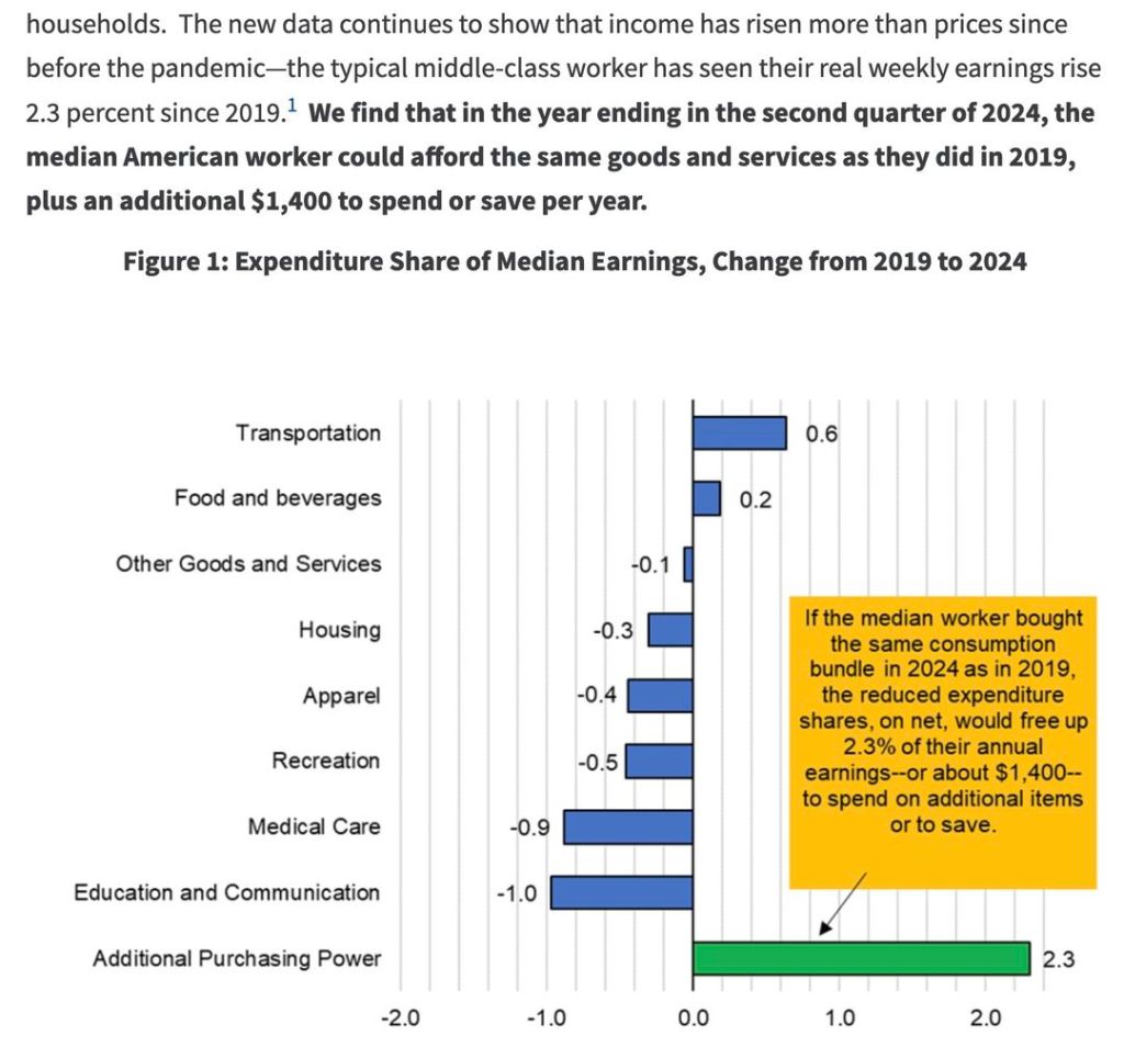
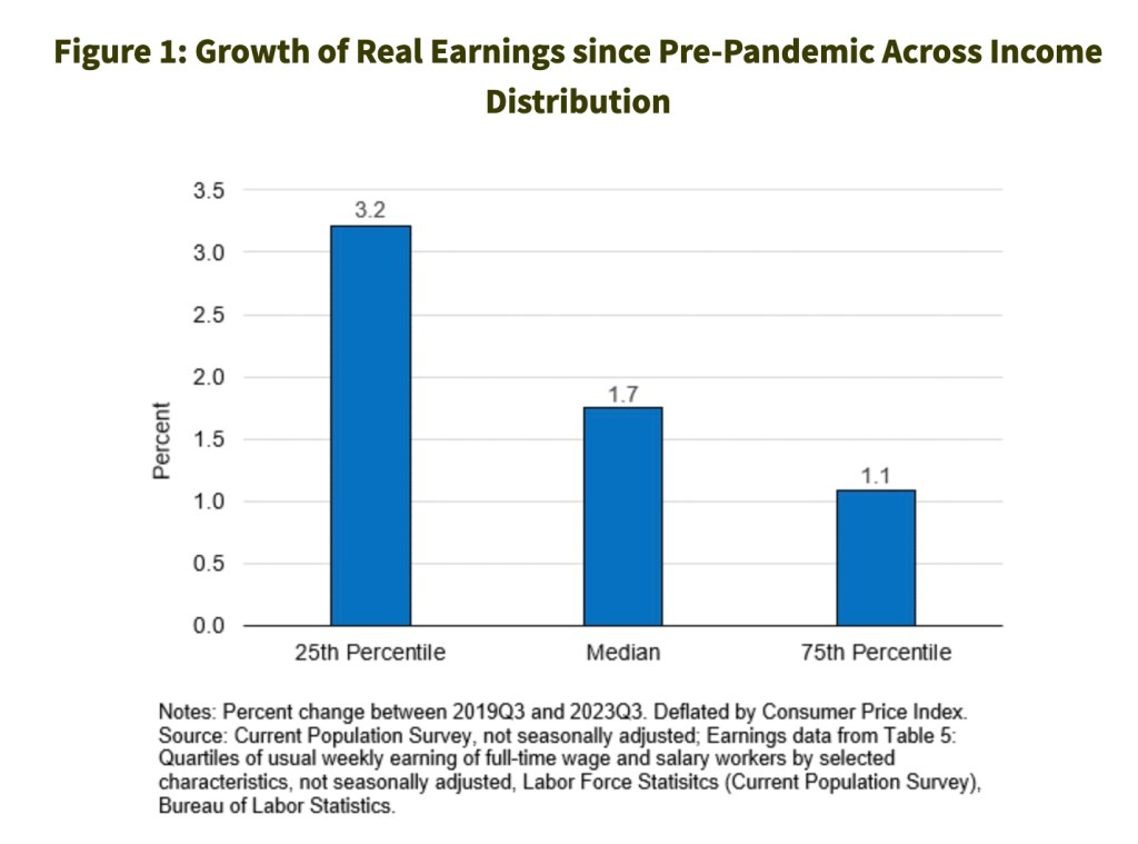
For example, one of the responses referred to is the oft-mentioned “20% increase in inflation” over the last (almost) four years and argued that there was no way that wage growth had exceeded that. Well, first, the data in what I shared was looking at 2019 to 2024, so it was over the full five years (because it was comparing pre-pandemic to now and, not for nothing, that includes parts of two presidential administrations). And second, this is where people anchoring on prices and not income (and also ignoring compounding) comes into play. For example, I’ve posted previously about how some Colorado teachers got in the neighborhood of an 18.8% raise in 2023. (To be clear, not all Colorado teachers, but many. And those that didn’t still got a pretty significant raise.) Which means that just that one year of a raise almost matches total inflation over the last four years. Then add in the other three years of raises, plus compounding, and you likely easily exceed inflation. Again, that’s not to negate the real impact inflation is having on folks (especially low income folks), but that you have to look at both sides of the equation and not anchor on just one side. And, as I’ve written before, inflation is always personal.
Although the data also shows that low income folks have actually had their wages increase at a faster rate than medium and high income folks. This is as of 2023, so would actually be slightly better if looked at today.
In addition to anchoring, humans tend to have both a recency bias and a negativity bias. There are good evolutionary reasons for this, but that doesn’t mean we can’t try to be aware of our cognitive biases and overcome them through, well, thinking. So, for example, everyone focuses on the surge in inflation we had coming out of the pandemic, but very few of them celebrated the lower than average inflation we had in the two decades before that. When you “zoom out”, you’ll see that – overall – inflation is still pretty darn good.
And, from one of those earlier posts (so this data is only through June 2022, it would look even better if updated to 2024),
As always, relative spending on different categories varies over time. But note the huge decline in food and a pretty significant decline in apparel (so food and clothing). And while housing (shelter) has increased recently as a percentage of expenditures, you have to factor in that some of that is because food and clothing have decreased (so even if nominal spending on housing remained the same, the percentage of total expenditures would increase), and some of that is because houses (and apartments) have gotten much bigger and much better (so, yes, maybe spending more, but getting a lot more).
So I guess my hope is that this helps folks think more deeply about these issues (and then perhaps modify some of their decisions and emotional responses as a result).
You should never look at inflation without also looking at changes in wages.
You should think about lifestyle creep and hedonic adaption, and realize that often you are not comparing apples and oranges (a house in 1950 vs. a house in 2024; gas mileage in 1974 vs. gas mileage in 2024, etc.)
You should always look at multiple time periods and, specifically, you should often zoom out to longer time periods to get a better perspective.
You should understand how percentages are calculated and how compounding works, and that “average” percentage over time is not the same (and actually pretty unhelpful) as “compounded” percentage over time.
You should understand that “average” (hopefully usually “median”) doesn’t mean it will match your individual circumstance.
You also should look more closely at your individual circumstances because we often anchor on prices but not income.
You certainly should question data and assumptions, and you shouldn’t completely ignore your intuition, but you also shouldn’t just reject things simple because they seem unbelievable to you.
Again, none of this is to minimize the real economic stress that some people are experiencing, or that we can’t do better in many areas. They are, and we can (and should). But I’m hopeful this might help some folks think more deeply about this topic, and that might change their perspective and decision-making a bit (as well as perhaps their level of happiness).