I’ve written a bit before about investing, volatility and asset allocation (here, here, and here, as well as in my books). Individual circumstances matter a lot, including – but not limited to – your goals, your risk tolerance and your investment horizon. But, in general, I think that many people are not invested enough in equities (stocks); their asset allocation is too conservative (especially for educators who have a defined benefit pension plan).
Given investment returns this year, some folks may be wondering if I still think that. The answer is yes, and that would be true even if bonds weren’t also having a horrible year. (Typically you expect bonds to not be correlated with stocks so, in a bad year for stocks, you would expect bonds to do well. This year they’ve both done horribly, so while bonds are down less than stocks, they are still down double-digits.)
So I found some charts from this recent Guide to the Markets from JP Morgan very interesting. One of the main arguments for bonds is that they are less volatile than stocks and therefore help “smooth the ride” along the way. That’s definitely true, but perhaps the amount of smoothing is a bit less than most people think it is. Here’s a chart that I think is worth spending a minute or two looking at.

If you take a look at 1-year returns, yep, bonds are much less volatile. But take a look at the 5, 10, and 20-year rolling periods, and the story is perhaps a bit different. Yes, bonds are still less volatile, and this chart doesn’t show how bonds do when stocks are down (which is part of the purpose of smoothing the ride), but I still think it illustrates that over longer periods of time any “smoothing” you get from bonds is pretty minimal, yet the impact on your returns is still significant. The difference between an all stock and all bond portfolio over the average 20 year portfolio is huge (see the box in the chart), and even the difference between all stock and 50% stocks/50% bonds is very large.
Now, none of that matters if you panic when stocks go down and sell. But one of the things I struggle with is this idea that the data (as well as the theory) is clear about what the best approach is, but it’s not the approach we’re going to recommend because we think people just won’t stick with it. Behavior is important, and I’m not suggesting we completely ignore it, but in how many other areas do we say, “Here is the best approach, but we recommend you take this one instead”?
So am I saying to never own any bonds? No. There are certainly times when your investing horizon is shorter, or other factors in your financial life would mean bonds (or other safe investments like Series I Bonds or T-Bills) should be a portion of your portfolio. But I am saying that folks who just pick a target date fund or a 60/40 portfolio or whatever simply because someone says “stocks are too volatile” is perhaps not thinking as deeply about this as they should be. (And, certainly, when they are young and saving for a retirement that is very far off, almost everyone should be very heavily weighted toward stocks, maybe even 100% in stocks.)
Now that chart above is from 1950-2021, so some folks might question why start at 1950 and why end at 2021? I don’t know for sure, but I imagine the starting at 1950 is trying to look at the modern, post WWII markets and the ending in 2021 is because that’s the last full year we have data for. Obviously 2022 has been rough, and will impact that chart some, but because both stocks and bonds are down a lot, it’s not going to change the overall picture.
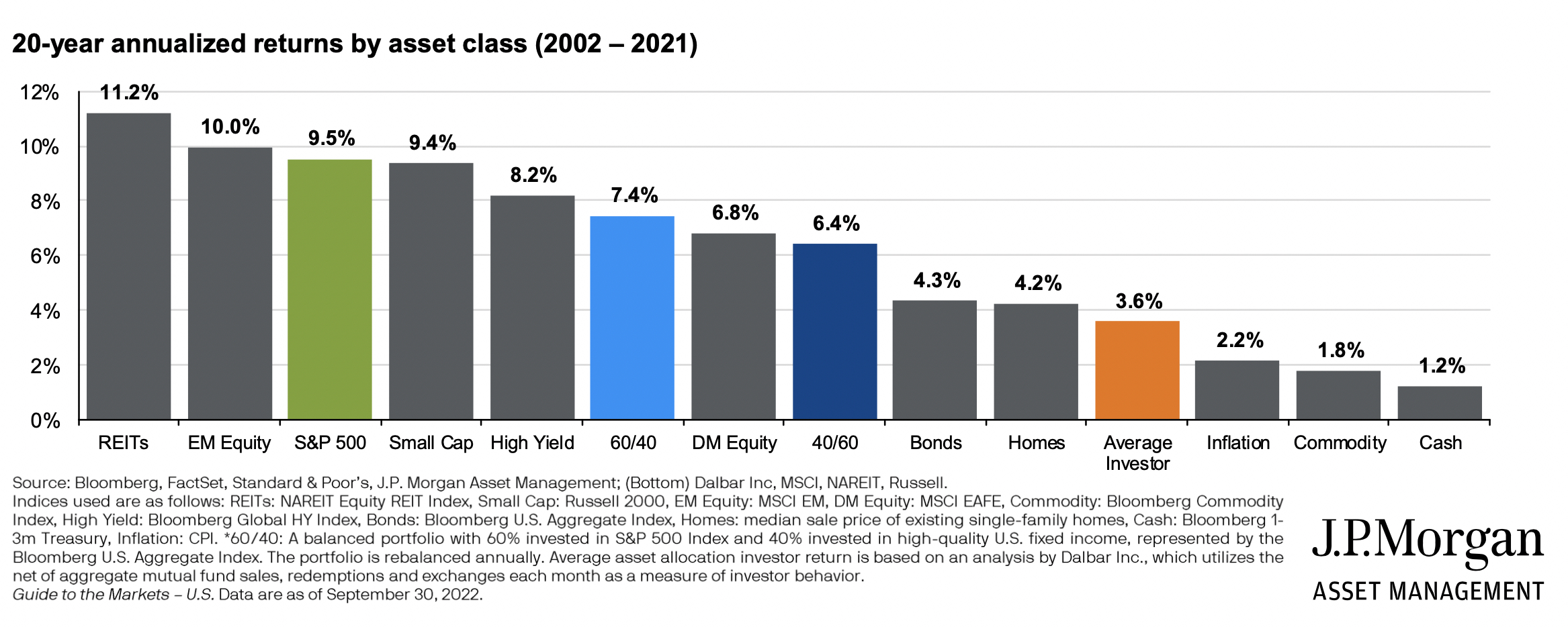
Some folks will then ask about more recent history, since in the last 20 years or so we’ve had the dot com crash, the Great Recession, the Covid Crash, and then this year’s downturn. So this is the second chart I wanted to point out from that report.

This chart does not include this year’s downturn (because this year isn’t over yet), but take a look at the asset returns over the previous 20 years (which includes the other three major downturns). In this chart, find the S&P 500 as a proxy for stocks, Bonds for bonds, 60/40 and 40/60 for balanced, Inflation (to see what you are trying to beat), Homes (just for fun), and the Average Investor (which perhaps says something about our current approaches). While 20 years isn’t long enough to draw too many conclusions, when combined with the first chart I do think it makes a pretty compelling case to take another look at your asset allocation if you have very much invested in things other than equities.
To be clear, no one knows what will happen in the future. And no blog post can address your individual circumstances, much less how you will behave when markets drop. But I hope this at least gives you some food for thought and spurs you to reexamine your assumptions around your asset allocation. It may simply reaffirm your current approach or it might cause you to make some adjustments. Either way, it is good to periodically interrogate your asset allocation, especially if it’s based on an assumption about “volatility” and “risk” that is perhaps not totally accurate.